

Oscar Wollheim curates a sumptuous suite of five great abstract masters – Bowling, Gilliam, Golding, Hoyland and Sylvester II – in his imaginative and vibrant exhibition, Modal Painting, at Maximillian William.
Having opened at Maximillian William on April 12th, its exhibition entitled Modal Painting brings together five paintings by five great abstract painters. Curated by Oscar Wollheim, the exhibition brings to light an art form that most art enthusiasts would associate with the 1950s: Jackson Pollock, Mark Rothko and the like. And don’t get me wrong, I LOVE me some 1950s American abstract expressionists, but seeing this combination of British and American artists and their individual influences mesh together in the gallery space was a unique experience that can only be achieved through the work of a truly great curator.
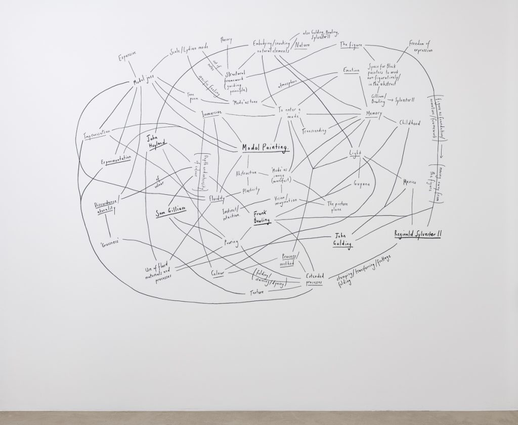
What I’ve often heard from most people who don’t have much knowledge of or interest in abstract art is the classic phrase: “my kid could make that!!”. However, I promise you – lovely readers – that your child could not actually make the works on display at Modal Painting. The one major theme captured throughout the exhibition walkthrough was the idea of connection, which is exemplified in Wollheim’s wonderful diagram created for the exhibition. It contains a crisscrossing of major ideas and influences that, ultimately, create a sense of cohesion in an exhibition that only shows one work per artist. Bringing forth processes such as ‘folding’, ‘pouring’ and ‘stomping’ that harmonise in these works to create ‘fluidity’, ‘atmosphere’ and ‘grossness’ takes skill as an artist. But most importantly, it takes influence, intention and introspection to find what drives you to create works of abstraction, which I doubt is the main focus of your six year-old niece’s thoughts right now.
The first work I was drawn to was by John Golding entitled J. 21 (Bibemus) from 1991. Having studied John Golding during my undergraduate degree, I was only ever really taught about his career as an art historian specialising in Cubism. What I found most interesting, upon seeing this artwork, is how clear those Cubist influences are. Upon a wash of burgundy and bright red are streaks of pale blue, almost as if the artist has cut into the canvas with a knife at these points. They seem to separate the composition into cube-like sections, helpfully giving the eye more to focus on than the brightness of the background. In addition, I couldn’t help but be drawn to the splashes of pale pink peeking through, lifting the composition beautifully. It was interesting to discover how Golding was influenced by the New York School of Abstract Expressionism in the 1950s, which becomes evident in the Rothko-esque shades of red. However, it is this connection to Cubism that discerns him as unique from this school of artists, and places him in a category entirely of its own.

On the opposite wall to Golding’s is a large-scale work by Reginald Sylvester II, titled Rise Young Gods All Paths Lead to Lazarus (2020). Considering its immense size, it is hard not to be drawn into its multitude of colours, streaks and prods that are applied in a thick, impasto fashion. For me, this work exemplifies everything I love about abstract art: the promotion of the imagination. Did you ever have those days as a child during the summer holidays, with nothing better to do but lounge in the garden and stare at the clouds going by, remarking to your friends that one particular cloud looks like a rabbit, or a fox, or another animal? That is the exact feeling of nostalgia that washed over me when taking the time to examine this work. I’ve convinced myself that a green splash in the bottom-left corner looks like a toy soldier, that a collection of white streaks in the centre-left looks like a west highland terrier.
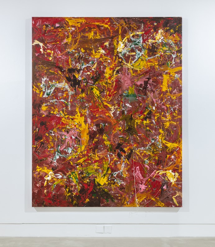
While the brain is always searching for recognisable forms amongst the abstraction, this is further promoted through Sylvester’s background in figurative painting. Having first started his career making figurative painting, he moved away from the figure as he began with his philosophy of finding images within the abstraction intertwined with wider theological traditions. The richness of the reds and yellows speaks to the Christian tradition, representing a kind of hellscape. The undulating forms, to me, acts as a reference to Dante’s Inferno and the circles of Hell, yet it is lifted through the splashes of pink that bring hope and faith to the viewer. Another aspect of the work that explores the artist’s roots is the spare strings from the canvas that have been pinned on, expressing the waste-not-want-not attitude that reflects diaspora communities, elevating the leftovers of the canvas to a level of importance within the composition.
Unlike Sylvester’s use of thickly painting across the canvas to create an impasto effect, British artist John Hoyland employed a mixture of a pouring technique and palette knife onto his artwork 4.3.70 (1970). What really struck me about this painting is the concept of natural elements, shown in a multitude of ways. As I mentioned earlier, I often found myself looking for forms within these artworks, so that here the notion of a rosebush come to the forefront. The bright rectangular pyramid of red set against the curved layers of red washes and the two shades of green seem to collide against each other on the canvas. Hoyland was invested in allowing the paint to fall where it wants through his use of the pouring technique, which allows for natural forms to come to fruition. This mainly comes from how he preferred not to be known as an abstract painter, as he felt the term implied a sense of premeditation when he wanted to focus on the sensuality of the painting process. Aesthetically speaking, this is my least favourite painting in the exhibition as I find the clash of the lime green and khaki a bit much for my eyes, but that’s the whole point of the painting: Hoyland allowed the paint to fall naturally onto the canvas, and that happens to be where it settled.

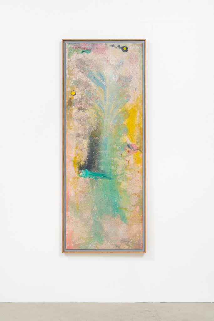
The solid, bold colours used by Hoyland is starkly contrasted by the ethereal and luminescent quality of Frank Bowling’s painting, Plume (1978). On first glance and not knowing the title, I mentioned to Chloe (the lovely Exhibitions and Research Manager at Maximillian William) that the central portion of blue which tapers out reminded me of the tree of life. Unsurprisingly, she informed me that many people who’d visited the exhibition also had the same interpretation. Like Hoyland, Bowling used the pouring technique to create natural forms, with this bird’s feather being the result of his process. As Wollheim notes in the diagram, depth and intensity are two qualities associated with Bowling which are easily brought to life in this beautiful painting. The pastel colour palette looks like something out of a production of A Midsummer Night’s Dream, with the pearlescent pink that encompasses the composition shimmering beautifully in the sunlight. It’s really a painting that is best seen in real life, as cameras just aren’t able to capture the splendour and sensuality Bowling has achieved.
Last, but not least is an untitled work by American artist Sam Gilliam from 2019. Having painted this at the age of 87, Gilliam proves that age is irrelevant when it comes to producing exceptional work. Gilliam uses watercolour paint to create gradients of purple, pink and blue in an extended process of folding the washi paper carefully and letting it dry. The colours are incredibly immersive, containing a lyrical quality in the natural eb and flow of the paint upon the surface. Having emerged from the Washington D.C. scene in the mid-1960s, he sought to disrupt the conventions of Color School painting. Since then, Gilliam has remained deeply invested in new modes of experimentation with abstraction, much inspired by the improvisatory ethos of jazz. This experimentation with washi tape has allowed the artists to create several effects that capture emotion and effervescence within the canvas. What really caught my eye was the strip of red paint on the left that spans the length of the canvas, appearing almost as a lightning bolt through the darkness of the purple background. The composition’s juxtaposition of brightness and darkness through its gradients looks like a negative of a stormy seascape at sunset, rendering it timeless as an example of the beauty that can be achieved through abstraction and a deep-rooted connection to the process of making art.

Modal Painting’s circular nature through its use of the gallery space, the contextual connections between the artists and their ranging influences truly gives every art lover a feast for the senses. For Wollheim, Modal Painting acts as a focus on the artist’s process, allowing for a renewed excitement in five masters of abstraction and a chance for the imagination to run wild in viewing these exemplary works of art. Woman to reader, I’m telling you, go see the exhibition before it shuts on May 2nd! It will leave you feeling like you wish you’d gone sooner as with every extra minute spent looking at one of these artworks, there’s endless amounts of interpretations to be made from even one square inch of canvas.
Modal Painting is showing at Maxmilliam William, London, until Sunday 2nd May. See here for more information. Click the links to follow the gallery on Instagram and Facebook.
Feature image: Installation View, Modal Painting, Maximillian William, London, 12 April – 2 May 2021. Photo Credit: Damian Griffiths. Image courtesy of Maximillian William, London.


